HTML forms have been around for a while, yet validation of user input solely using HTML and Javascript is still a painful task to tackle. Angular 2 has some nice features that make form management very easy and pretty much painless. This post will focus mostly on template-driven forms, which are the least verbose option offered by Angular 2.
Template-driven forms
Template-driven forms are my favorite option because most of the magic happens in the HTML template, which means that very little Typescript code has to be written. Here is the form we’re going to work with:
<form> <label>Firstname:</label> <input name="firstname" required="" type="text" /> <label>Lastname:</label> <input name="lastname" type="text" /> <label>Street:</label> <input name="street" type="text" /> <label>Zip:</label> <input name="zip" type="text" /> <label>City:</label> <input name="city" type="text" /> <button type="submit">Submit</button> </form>
This is just a regular form, nothing fancy in here. What I want to do is have Angular 2 handle the submission of that form. In order to do that, I need to add the following code:
<form #form="ngForm" (ngSubmit)="logForm(form.value)" >
This does two things:
- It creates a local variable in our template called
form, which has some magic powers. One of them is to hold the value of our form as a Javascript object, which can be accessed withform.value - On submit, the
logForm()method will be called on my component, with the current value of the form as a parameter.
By the way, you may wonder what my component looks like. There it is:
import { Component } from '@angular/core';

@Component({
  moduleId: module.id,
  selector: 'app-forms',
  templateUrl: 'forms.component.html',
  styleUrls: ['forms.component.css']
})
export class FormsComponent {

  logForm(value) {
    console.log(value);
  }
}
Pretty much an empty component. Its template is the HTML I introduced earlier. Now in order to make this work, we have to import some dependencies in our ngModule. Form specific code is highlighted below:
import { NgModule }      from '@angular/core';
import { BrowserModule } from '@angular/platform-browser';
import { FormsModule }   from '@angular/forms';
import { FormsComponent }  from './forms.component';

@NgModule({
  imports: [
    BrowserModule,
    FormsModule
  ],
  declarations: [ FormsComponent ],
  bootstrap: [ FormsComponent ]
})
export class AppModule { }
Almost there! All we need now is to tell Angular which form elements we want to be bound to our form model. This is achieved using the ngModel directive as follows:
<input type="text" name="firstname" ngModel required>
<br/>
<label>Lastname:</label>
<input type="text" name="lastname" ngModel>
<br/>
Now if I fill out that form and hit the submit button, Angular 2 will call the logForm() method, which will basically output our form model to the browser console:
{firstname: "Alain", lastname: "Chautard"}
That was easy, right? We just added a couple of directives to our HTML and we have an object that we could send to our server using AJAX.
What about validation?
My form already has a required attribute in place. If we try to submit the form with no first name information, it won’t be submitted and the browser will display a message to highlight the required field.
This is a great feature, yet it relies on browser specific implementations as it’s based on the HTML5 specification. Let’s see how to define our own custom error handling. First we tell the browser that we don’t want its default HTML5 behavior:
<form #form="ngForm" (ngSubmit)="logForm(form.value)" novalidate >
Then we add the following definitions to our CSS file:
.ng-valid[required] {
  border-left: 5px solid #42A948; /* green */
}

.ng-invalid {
  border-left: 5px solid #a94442; /* red */
}
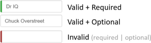
And… that’s it! Angular 2 automatically adds and removes CSS classes to each form element based on its validity. No Typescript code has to be written to achieve this. As a result, my form will now be styled as follows depending on the data entered:
Let’s do more than CSS styling. Let’s say that we have a zip code field that is required, should be exactly 5 digits long, and that an error message will show up to help the user enter valid information. The following code will do exactly that:
<input type="text" name="zip" #zip="ngModel" required pattern="[0-9]{5}">
<div class="alert" [hidden]="zip.valid || zip.pristine">
  Please enter a 5-digit zipcode
</div>
Let’s take a look at the above code. First, we create a local variable using the #zip syntax. zip will give us access to form state attributes similar to the CSS classes that Angular 2 deals with.
Then we define a 5-digit pattern, which is regular HTML5 code, nothing Angularish here. Finally, we add a div that will be hidden if zip.valid is true or if zip.pristine is true. That way the error message will show up only if the user enters wrong information, and will be hidden as long as the text input is pristine, which means the user hasn’t typed anything yet.
As you can see, customizing our forms with validation and error messages is a fairly easy thing to do in Angular 2. The best part of it is that everything is achieved through HTML attributes, which means less Typescript code to write and to maintain.
Angular 2 RC5 released the final version the forms API, which means you can safely start using forms without fearing that next releases will have a different implementation.